
Color has a huge affect on how we feel and how we react to our surroundings. We want successful color schemes in our home that are not only pleasant to live with, but that reflect the moods and personalities of the people living in it. Creating living areas that invigorate or stimulate us are just as important as creating other places that allow us to rest and relax. The right balance of light and color for bedrooms, family or living rooms and kitchens are individual in that these rooms serve different needs in daily life.
There is a fear factor when it comes to decorating or selling a home: paint colours (other than white) will make it boring to live in and hard to sell. Trust me, paint is not at the core of this urban fear. Maybe, just maybe, it was rooms of dated wallpaper deemed too difficult to remove, obsolete avocado appliances that coordinated with obsolete harvest gold Formica countertops, or possibly the wall-to-wall shag carpet that retained every aroma from the past. Regardless, word came down from somewhere above that said, "Keep it neutral and it will sell faster!" That's when white became the sterile emotionless purgatory colour for walls during the home-selling process.
As a proud owner of a home, you need to make it the best it can be, everyday, whether you live in it for 0, 3, 5, 10, or 25 years more years. If done right, paint colour will add great value to your home while you live in it and when you go to sell it. And even if you are not selling, you really deserve the same consideration of creating a beautiful environment for yourself.
There is a right way to add value with paint colours when you're selling and a wrong way. We are all familiar with the "wrong way"; Homes with colours that when you walk in through the door you can't help but notce the busy noise and think to yourself: Shut it Down! No need to expand on that. I will, however, expand on the right way to choose paint colours so your home sells faster, and generates lots of enthusiasm. I am certain because there are many testimonials that the right Colour on walls sells homes faster-and apartments and condos rent out easier. Its when it apeal to the prospects magazine reading emotion.
There are 2 things that the right paint colours will do for your home that will make it sell even faster:
1-The right wall colours really make a home stand out in the market by making it look updated, well-kept, and well-designed. Furniture showrooms know that accent vignette wall colours sell merchandise, and the same goes for choosing the right "vignette wall colour" for your home.
2- The right wall colours also make older outdated colours and design look newer, and this makes buyers forgive a multitude of sins. The right colour makes older surfaces brighter, slightly-used areas cozier, and transforms lighting into inviting atmosphere.
While Real Estate agents rightfully advise sellers to un-clutter the home by removing personal pictures and extra knick knacks so new home-buyers are able to visualize their own decor, you shouldn't just white-out wall colours to completely erase a home's colour character. Instead, This is how you do it right:
Look at the non-negotiable, non-removable parts of the home like flooring, wood surfaces, stone surfaces, paneling, tile, cabinets, painted shelves, countertops and find common colours among them, then develop a new co-ordinate colour scheme to enhance the home character.
 You might end up with beautiful neutrals like Muslin, and accents like Cocoa or Forest, as colours that make your home look like a must-have palace, show room, castle, cottage, mansion, or lair. The walls may end up being light or rich depending on what looks good with your non-negotiable surfaces. A home with luxurious colour on the walls that has the same flooring, kitchen surfaces, bath surfaces, and trim as a home with builder-beige walls will more likely feel good to consumers emotionally as a beautiful environment . Emotion SELLS! Are you ready to sell or buy back your own home
?
You might end up with beautiful neutrals like Muslin, and accents like Cocoa or Forest, as colours that make your home look like a must-have palace, show room, castle, cottage, mansion, or lair. The walls may end up being light or rich depending on what looks good with your non-negotiable surfaces. A home with luxurious colour on the walls that has the same flooring, kitchen surfaces, bath surfaces, and trim as a home with builder-beige walls will more likely feel good to consumers emotionally as a beautiful environment . Emotion SELLS! Are you ready to sell or buy back your own home
?The Basics
Check out these colour decorating tips to get started on decorating your home with a variety of colours. Determine which colours will look best in your home and will complement your mood and personality with the colour wheel.
Colour
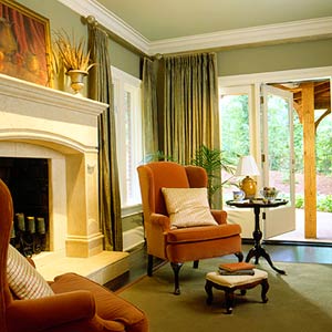
We know that creating a colour palette can feel like an overwhelming task due to the infinite number of possibilities, but with a little guidance it can be a fun and engaging project. Below we've provided some colour theory basics to get you started. Colour is the key element of any interior décor, and the associations that colours have in the human mind can define an area's function in the home or workspace. A quiet workspace might need the tranquil feeling created by cooler colours like blues and greens. Gathering places might want to feel a little livelier. Warm colours like reds and oranges tend to add excitement to an environment.
Colour Considerations
There are numerous considerations to gather when choosing a colour palette for your living or working space. Consider what the room is meant to be in your life, how do you need to feel in that room. This allows you to consider the mood required (ei. Fundamentally you need to make sure it incorporates the colours of any existing furnishings and décor that are not being replaced. Also be sure to consider the amount of light the area will receive, as this can alter the 'value' of the colour, making it appear brighter or darker. Try to develop a cohesive colour palette; although variety is the spice of life, too much variety can feel chaotic and discordant.
 Cool Colours
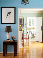
 Cool colours have a relaxing and rejuvenating effect. Greens and blues are good for contemplative and cleansing areas such as a reading room, bedroom, or master bath.
Neutral Colours
The versatility of neutral colours is truly underappreciated: they blend a soothing and welcoming environment with a sense of activity. Neutral colours exude elegance, sophistication, and a touch of drama. They are great for multipurpose living areas, offices, and meeting rooms.
Monochromatic
For a real sense of coordination consider a monochromatic colour scheme which consists exclusively of various shades of the same colour; these fit nicely in bathrooms, nurseries, or themed rooms.
 Warm Colours
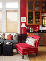
 Warm colours have an energizing and engaging effect; reds, yellows, and oranges will lift people's spirits and get them interacting with each other. Warm colours are great in areas where you plan to entertain.
Colour and Depth Perception
Colour can also be used to alter the appearance of space. Darker, warmer colours 'reach' out to you, making dark ceiling appear lower and dark rooms feel cozier. Lighter and cooler colours recede; rooms painted with those colours feel more expansive
10 Colour Selection Tips
Following are a few tips can help you find the right palette for your home:
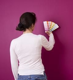
 Tip 1. Avoid going to the store with preconceived colour ideas and don't choose colours at the store. Instead, choose a wide variety of colour samples to consider from the store selector and take them to the room being painted.
Tip 2. Ask yourself what mood you want to convey in the area being painted-A quiet workspace might need the tranquil feeling created by cooler colours like blues and greens. Gathering places might want to feel a little livelier. Warm colours like reds and oranges tend to add excitement to an environment.
Tip 3. Look around your room for existing non-negotiable, non-removable elements like carpet or furniture or appliances that will not be changing - their colour will play a part in the colour-palette decisions.
 Tip 4. Place your colour samples on or near the existing elements in the room to be painted. At this point you should immediately see any colours that won't work in your space and eliminate them.
Tip 5. Consider the remaining colours, and keep those colours you love and reexamine those colours you didn't know you liked-be open to consider a surprise colour or a colour accent might be what your space needs.
Tip 6. Learn more about the colour wheel (below), it is an invaluable tool. For a pleasing scheme, a blend of warm and cool colours is often best. Use the colour wheel to find colours that work well with your existing elements. Even if you are only using one paint colour in your room, the colours of other items in the room will create the colour scheme.
Tip 7. Remember, heavily saturated colours have great weight: our eyes are drawn to them. They make great accents, the smaller their use the better. For an overall colour, look for more neutralized colours. For example, if you have a desire for a yellow room, the perfect yellow might not be yellow at all, but a neutral colour with yellow undertones.
Tip 8. Know that colours intensify when applied en mass so what looks right on a swatch is often too dark or heavy on a wall. Selecting a colour slightly lighter than your first choice is suggested. You might want to purchase a small quantity of your final selection choices and paint them on large pieces of foam core board to get a better feel for sample.
 Tip 9. Be aware of available lighting-colour will look different in varying light sources. Colour viewed in 5000k natural light during the day changes once a 4200k indoor light is turned on. Old style "cool" fluorescent lights tend to wash out colours. Colour in a room with "warm" incandescent light appears more natural. A more energy efficient choice is the newer compact fluorescent light bulbs (CFLs). They are now available in a variety of colour temperatures, with a 3500k being the warmest or most pleasing-not too cool or too warm and reveal colours very accurately.
Tip 10. Don't be afraid to use colour-it will enrich your space. It can also be changed relatively easily when you have a desire to explore a new colour palette in the future!
The Paint Colour Wheel
Picking out paint colours can be a confusing experience, leaving you racked with indecision as you peruse swatches from paint companies intent on re-creating all of the 7 million colours distinguishable to the human eye. Trying to figure out which of those colours will mix harmoniously on your living room wall is enough to make you turn straight to the ecru- and eggshell-white family and never leave.
One way to go, however, is to use a complementary colour scheme. Proving the rule that opposites attract, these pairings can always be found at opposite ends from each other on a paint colour wheel. When put together, they bring out the best in each other, making both colours look cleaner and brighter than if either were mixed with, say, a neutral gray or a different shade of the same hue. The two colours you choose don't have to have equal prominence in the room to work. You can use one as the main colour and the other as an accent, or to test a pairing you can bring small coloured accessories into an already painted room to see how you feel about the pairing.
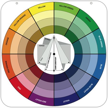 An essential tool for paint pros everywhere, the Oswald Colour Wheel is constructed to help you see the relationships between different hues. The bases are three primary colours: red, blue and yellow. These are then combined to make the three secondary colours: orange, green, and purple. Finally, the remaining six colours on the wheel are known as tertiary colours and are mixes of the secondary colours, including such hues as red-orange and blue-green.
 The Paint Colour wheel provides guidelines about the exotic paint colour combinations. The palette of colours is a collection of different house paint colours that can be primarily categorized into three broad categories namely primary, secondary and tertiary colours. This versatile paint colour wheel takes into the fantasy world of colours and shows you the glimpses of beautiful shades. It enhances your understanding about harmonious colour combinations by giving you a broader picture.
The primary colours form the base of the colour wheel. Three shades mainly yellow, red and blue fall into the category of primary colour collection. These primary colours are bright, hot and exuberant. To form the colour wheel, next to primary colours a layer of secondary colours is formed. Secondary colours are the result of innovative creations of primaries.
To prepare secondary colour, one primary shade is blended with the other primary shade. This blending technique is called subtractive process. These colours are also called complementary colours. The three secondary colours are orange (combo of red and yellow), green (yellow plus blue) and violet (blue and red).
Final stage of making the wheel is to prepare the last layer of colours known as tertiary colours. These tertiary colours are the resultants of mix matching one primary with another secondary colour. Popular tertiary shades are blue-violet, green-yellow, red-orange etc. Make your sweet home more beautiful by following the tips on paint colour wheel.
Familiarizing yourself with the colour wheel can help you understand how to best mix and match a cool colour with a warm one, for a naturally balanced room.


CLICK ON THE IMAGES
OR write: LikeNewPainting@msn.com
What Kind of Paint Do You Need?
Why do some five-year-old paint jobs peel and flake and fade away
while others done sometime during the Reagan era look as if they were laid on last week?
What is Paint Quality?
Consumers really don't believe warranty claims, but in the absence of other criteria they do use the price and warranty as a guide to quality." For example, offers of two paint lines: Royal Colour ($20 to $25 per gallon, 15-year warranty) and Quality Colour ($16, 10-year warranty). While price and warranty usually indicates quality, with some brands of paints tagged so pricey per gallon, indecision is hell and going by price alone can get expensive. And price and warranty do not necessarily reflect a grade of quality!
 There are other ways to pick quality paint out of a lineup:
Proper pigments. Quality pigments allow a good paint to cover fully with just one coat. Paints with lower-cost pigments often must be applied in several coats. That means more work, which makes buying low-quality paint a poor financial decision. The best pigment is titanium dioxide. Look for it when ingredients are listed on the can.
High percentage of solids. The solids are what's left on the wall after the paint has dried. Anything over 45 percent is considered good; the higher the level of solids, the better, because you'll wind up with a denser, more durable coating. For example, a gallon of Dulux Exterior Flat contains 52 percent solids by weight. However, be aware that some companies add cheap fillers to beef up the percentage of solids - that makes it wise to stay away from inexpensive brands of paints with a high level of solids. Although you typically won't find information about solids on the label, check with your paint retailer, ask to see product data sheets or fire up your modem and check the company's Website.
All-acrylic binder. The binder is what holds the pigments, mildewcides and other solids that form the actual paint film. Look for latex paint with an all-acrylic binder, which is inherently more weather resistant than vinyl or vinyl-acrylic.
Many paint companies use a modified acrylic for their interior lines and all-acrylic for premium exterior paints made to endure the elements. For example, Glidden's Spred Satin is an interior with a modified acrylic, while its Spred Dura Satin is an exterior paint with an all acrylic binder. If you don't see "100% Acrylic" or "All Acrylic" in bold on the front of the can, check ingredients for "acrylic polymer."
Also be sure you pick the right paint for the surface you're covering. Most water-based exterior paints can be used on wood and hardboard siding and trim. They're also fine for vinyl and aluminum siding, and most masonry. On stucco prone to cracking, use an elastomeric paint. It's more flexible than standard coatings and leaves a durable film that's twice as thick (about 5 mil). An example is the stucco paint from Valspar, which bridges hairline cracks to keep out water.
You can also buy paint tailored to conditions in specific regions of the country. Dutch Boy's ClimateGuard line was the first of these paints from a major manufacturer. For example, its Southeast formulation has extra mildewcides for a humid climate, while Northwest paint is higher in solids to resist months of rainfall.

Share this website
with someone you care about.
Website Last Revised: